logo design & branding expert with 20+ years experience
Logo & Branding Projects
Acadiana Tap House
Brand Build Out
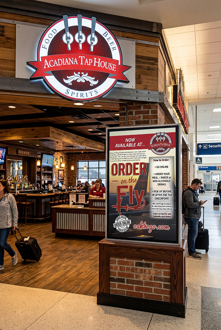
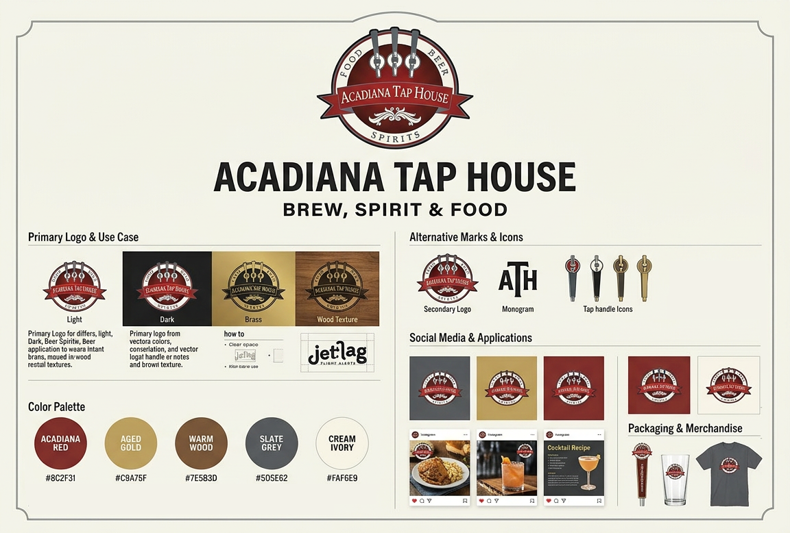
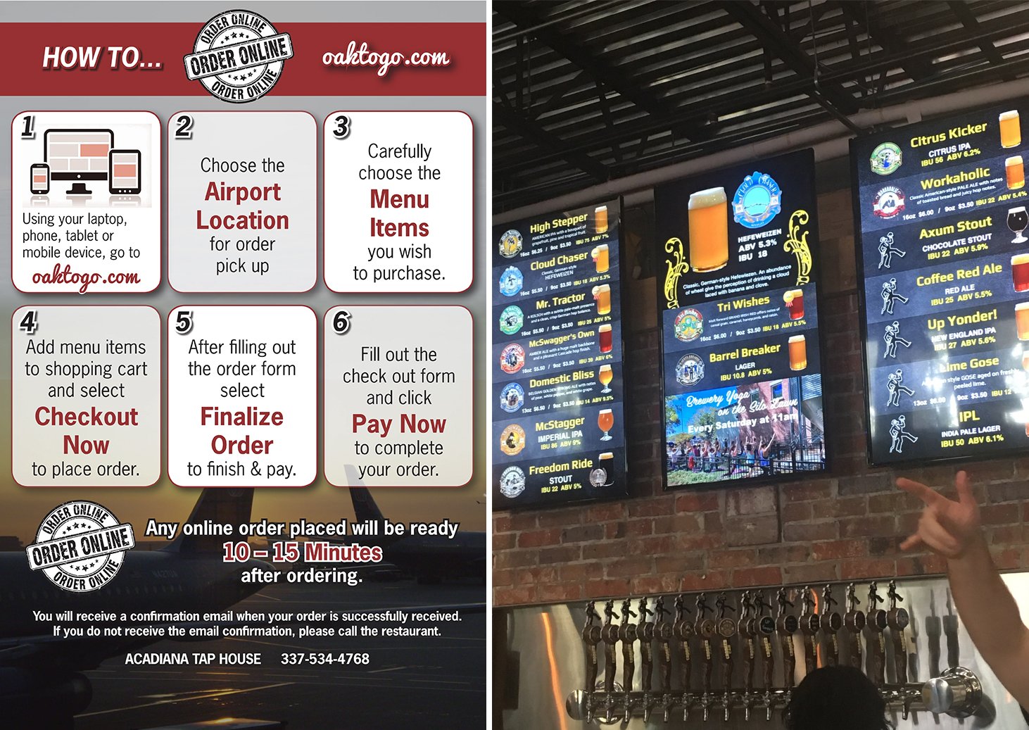
Airport-based tap house – logo designed to be clean and highly legible at a distance, incorporating modern elements with subtle craft cues The color palette leans into rich, inviting tones, accented with high-contrast details to stand out within the busy terminal environment. Cohesive, elevated feel, blending polished metals, wood textures, brick, and streamlined typography to evoke both craftsmanship and efficiency. The overall look and feel is warm, energetic, and easy to navigate—drawing travelers in.
Blue Shield Sanitation
Brand Build Out
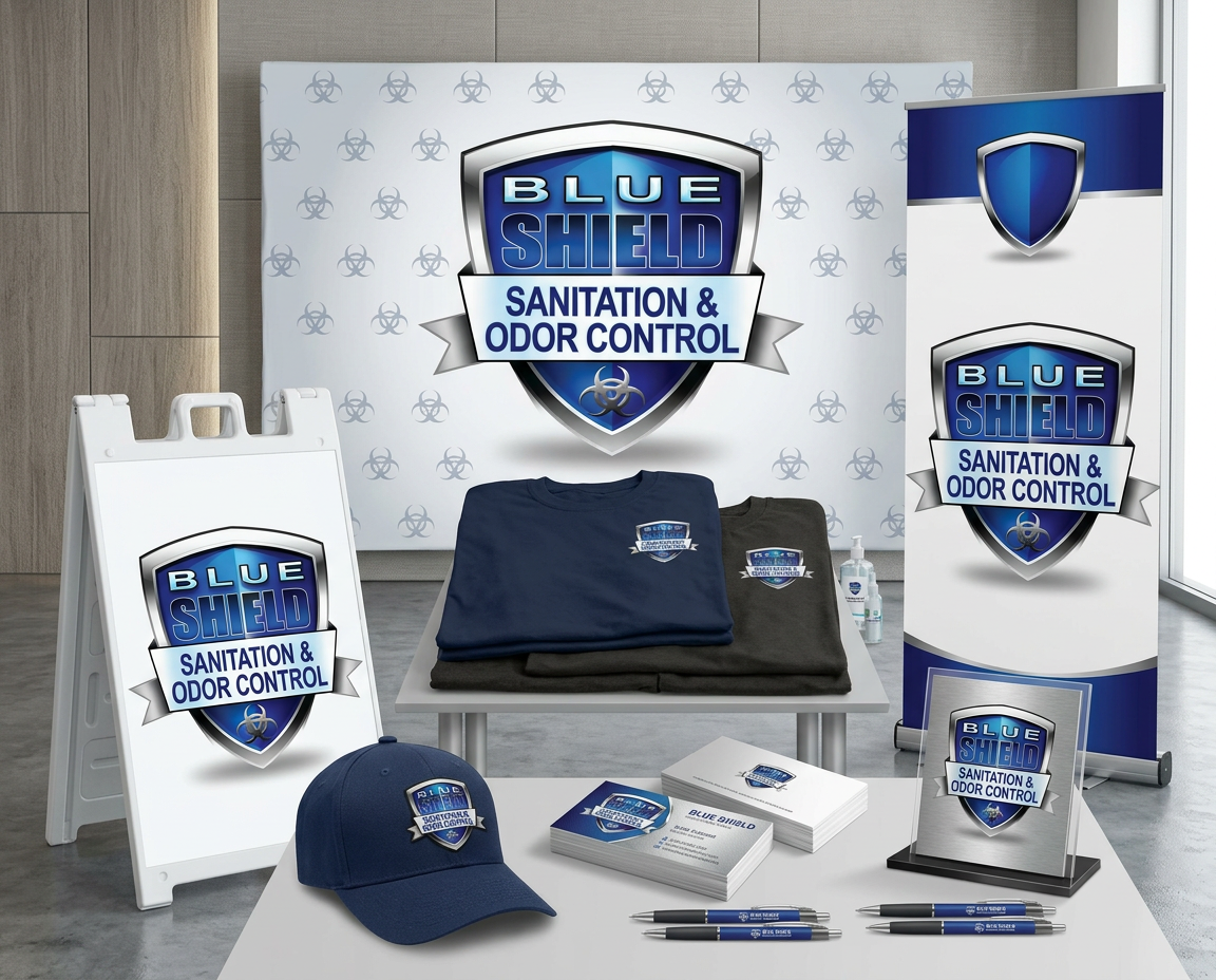
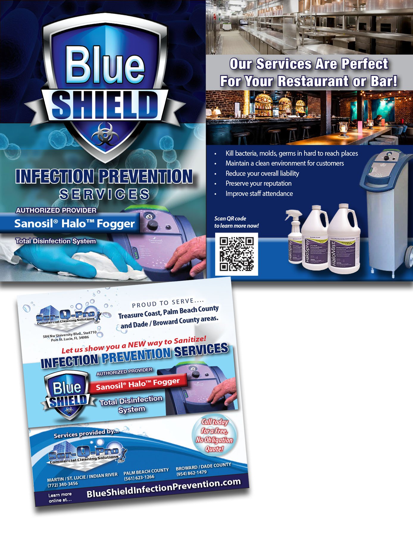
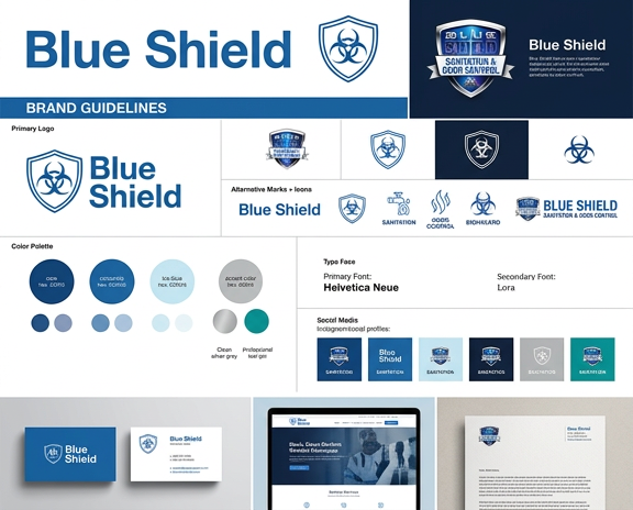
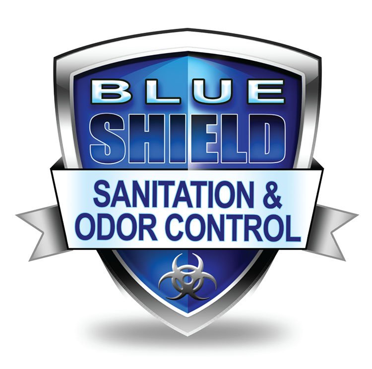
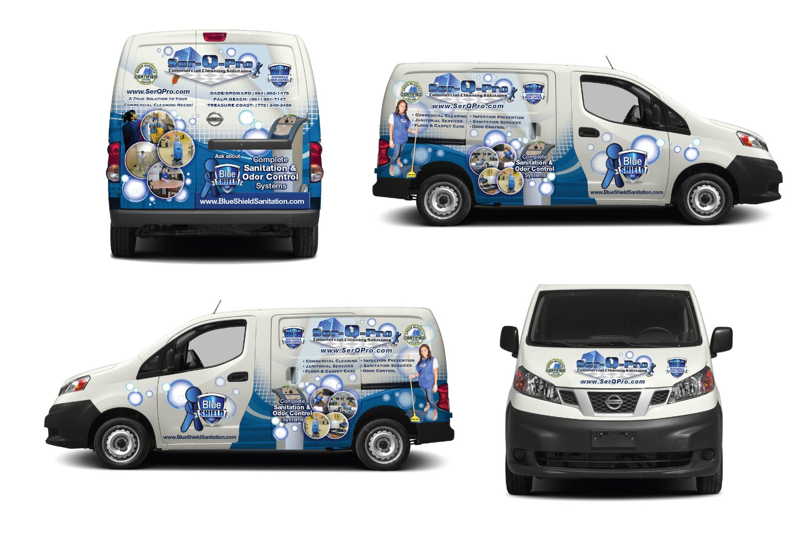
Environmentally friendly cleaning company offering sanitation and odor control through a particle displacement system using fogging machines to provide the ultimate clean for homes and businesses. The color palette is varying blues, gray and white, paired with cleaning elements, to accentuate cleanliness and trustworthy practices,.
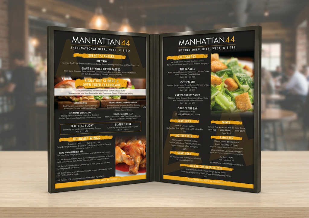
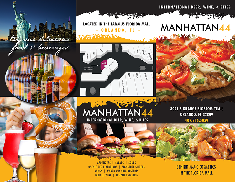
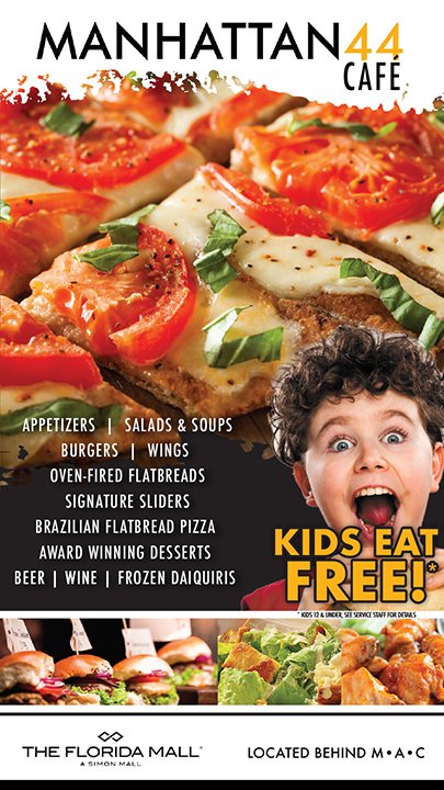
Manhattan44 Brand Build Out
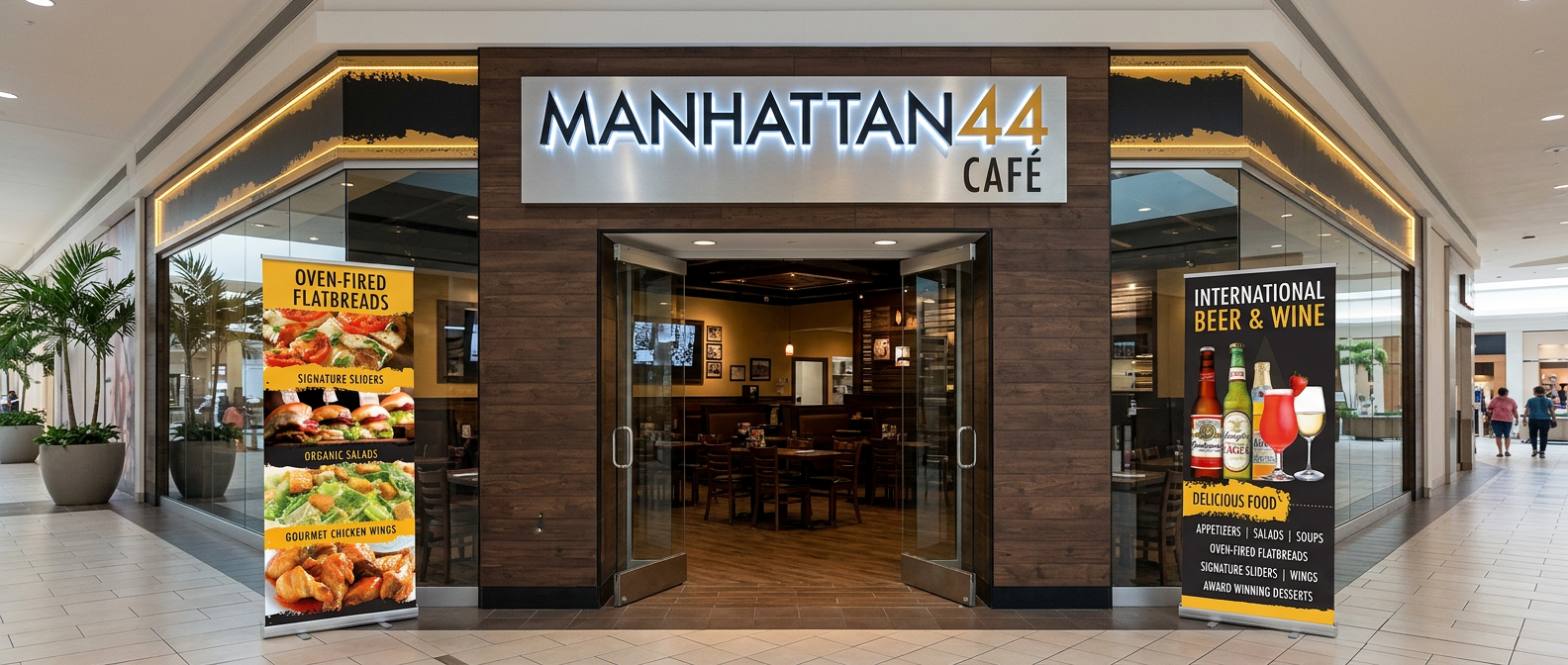
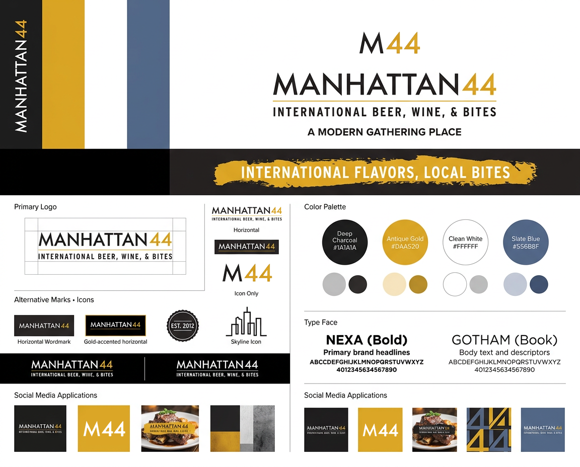
Manhattan 44 is a sleek, urban-inspired restaurant brand that captures the energy and sophistication of New York dining with a modern, approachable edge. Built around a refined yet bold identity, the brand blends clean typography with a moody, metropolitan color palette. Elevated but accessible, pairing high-quality, modern menu offerings with a visually striking environment that feels fast-paced and stylish. From signage to menus to digital presence, Manhattan 44 is designed to feel iconic and effortlessly cool—a place that delivers big-city flavor with standout attitude.
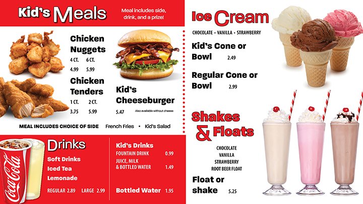
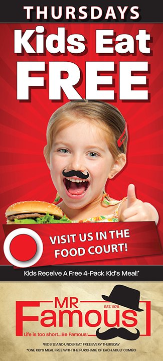
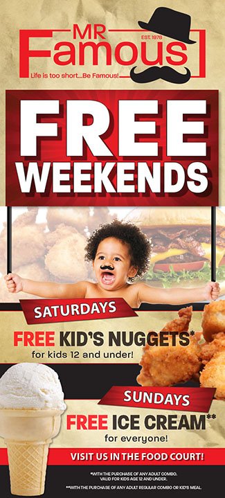
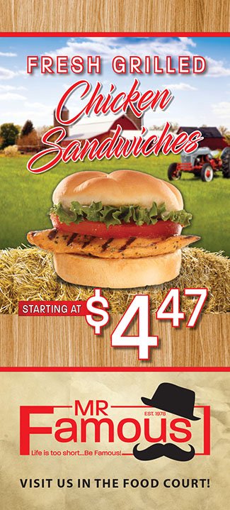
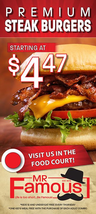
Mr. Famous Brand Build Out
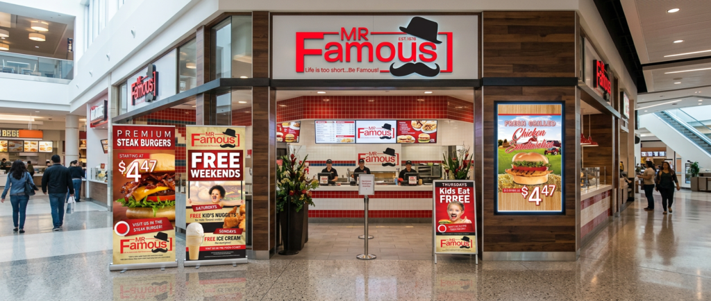

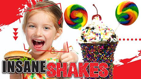
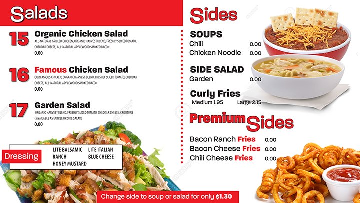
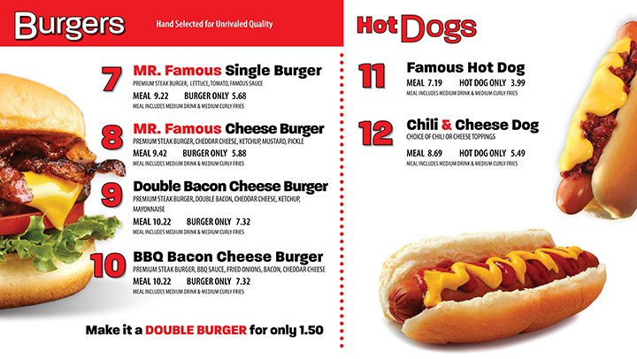
Mr. Famous is a bold, personality-driven fast-casual brand that pairs crave-worthy food with a clean, modern identity. The signature logo with the playful mustache and hat is the focal point, using bold colors and styling, making the brand both premium and approachable. Value-forward messaging, and consistent cross-channel design from storefront to merchandise and more, positions Mr. Famous as a confident, memorable destination that’s fast, flavorful, and impossible to ignore.
Equestrian Services International (ESI)
Brand Build Out
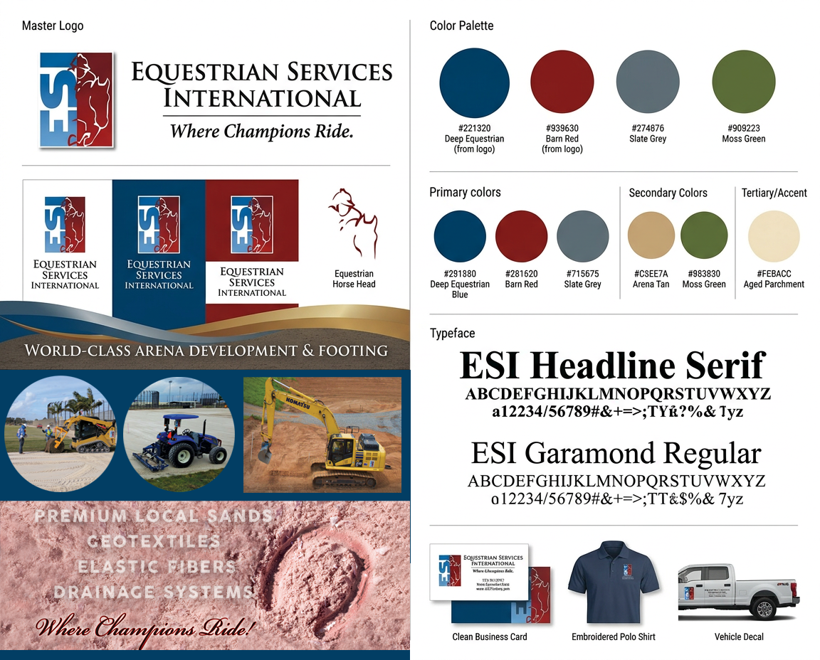
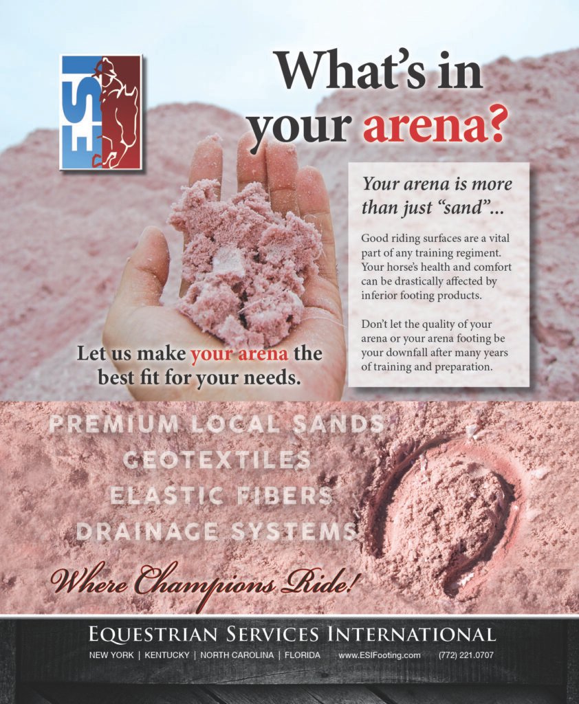
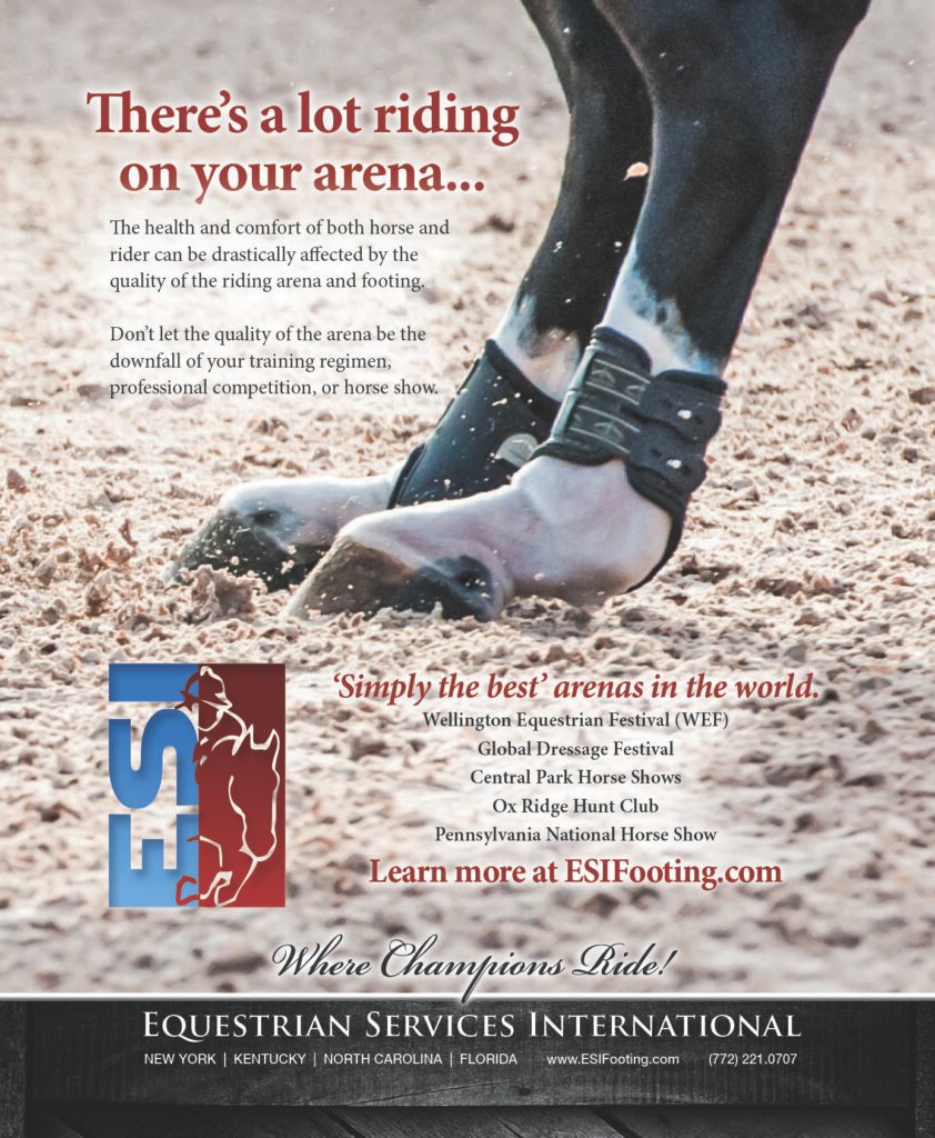
Equestrian Services International is a globally positioned equine brand that reflects the discipline, elegance, and precision of the equestrian world. The identity is rooted in classic sophistication with clean, timeless typography, photography, and a patriotic color palette using red, white and blue. Visual elements draw subtly from equestrian culture, balancing luxury with professionalism to appeal to both elite clientele and industry partners. From digital presence to branded materials, the brand communicates expertise, reliability, and a seamless standard of service, positioning Equestrian Services International as a premier name in equine arena building and maintenance.
Emerald Coast Bar & Grill
Brand Build Out
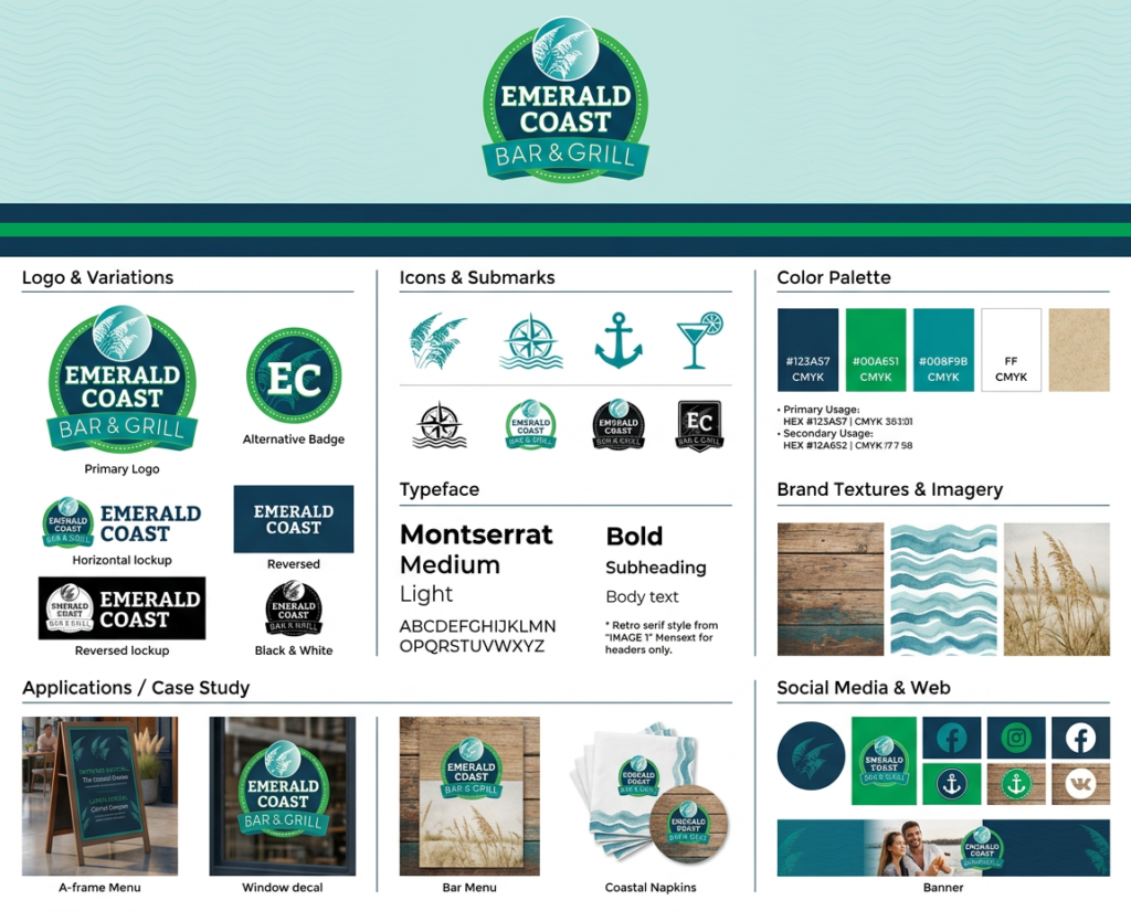
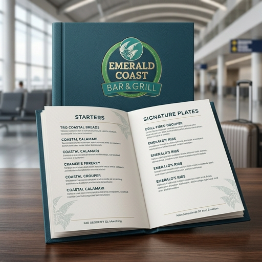
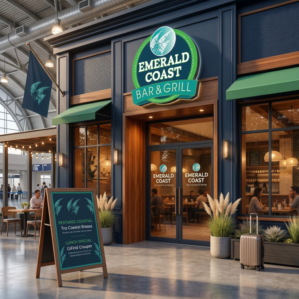
Embodying a sun-soaked spirit of coastal living while maintaining a polished, inviting feel using an ocean-inspired palette—greens, deep teals, sandy neutrals, and crisp whites—paired with clean, modern typography Approachable yet distinctive—equally suited for a laid-back lunch, sunset cocktails, or a lively evening crowd.
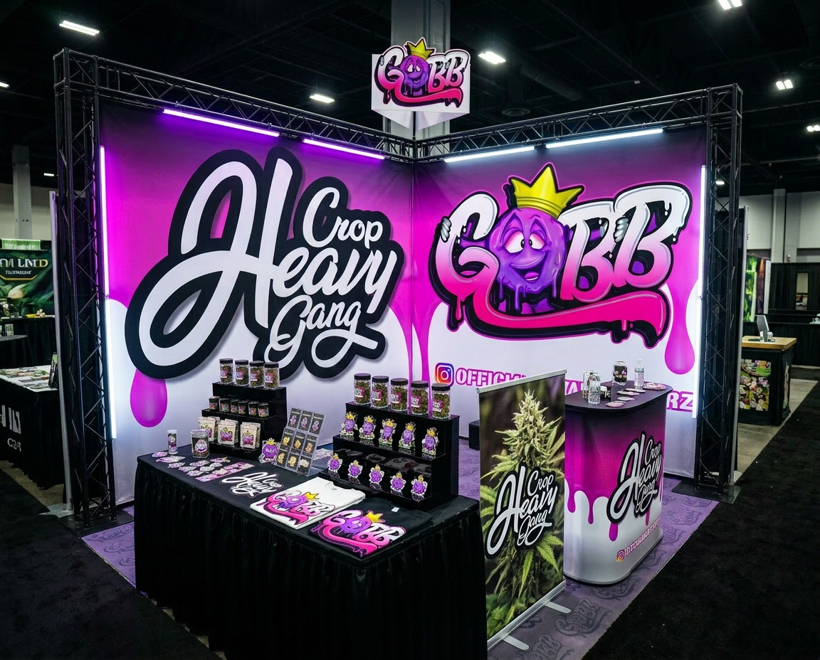
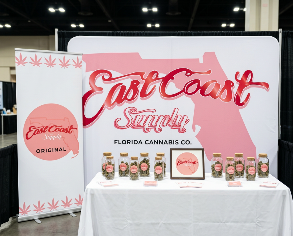
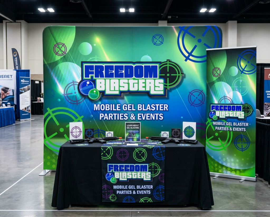
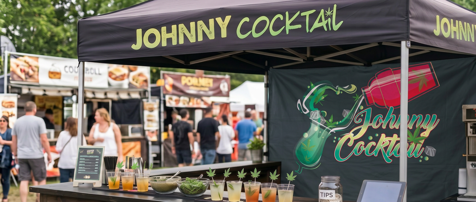
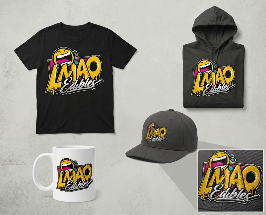
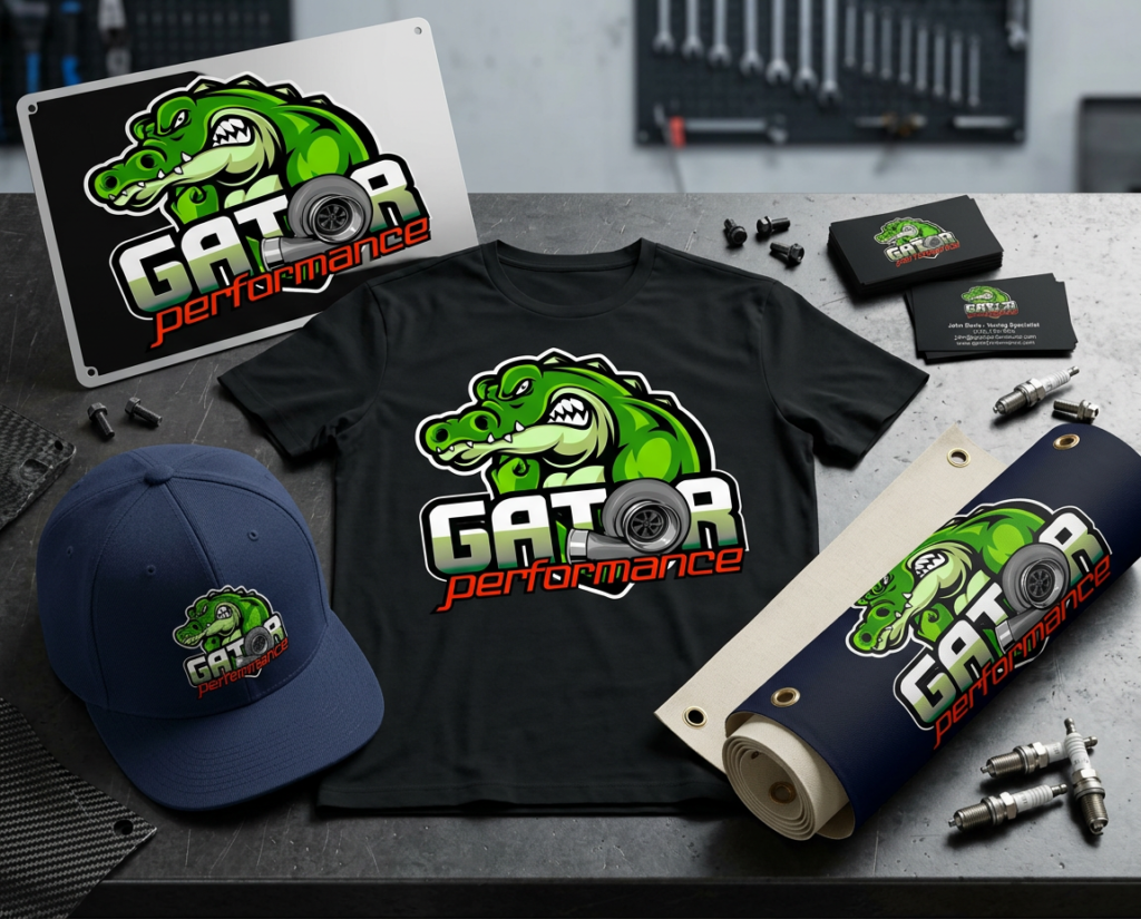
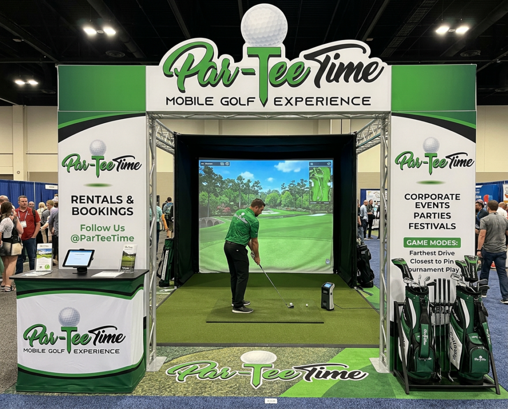
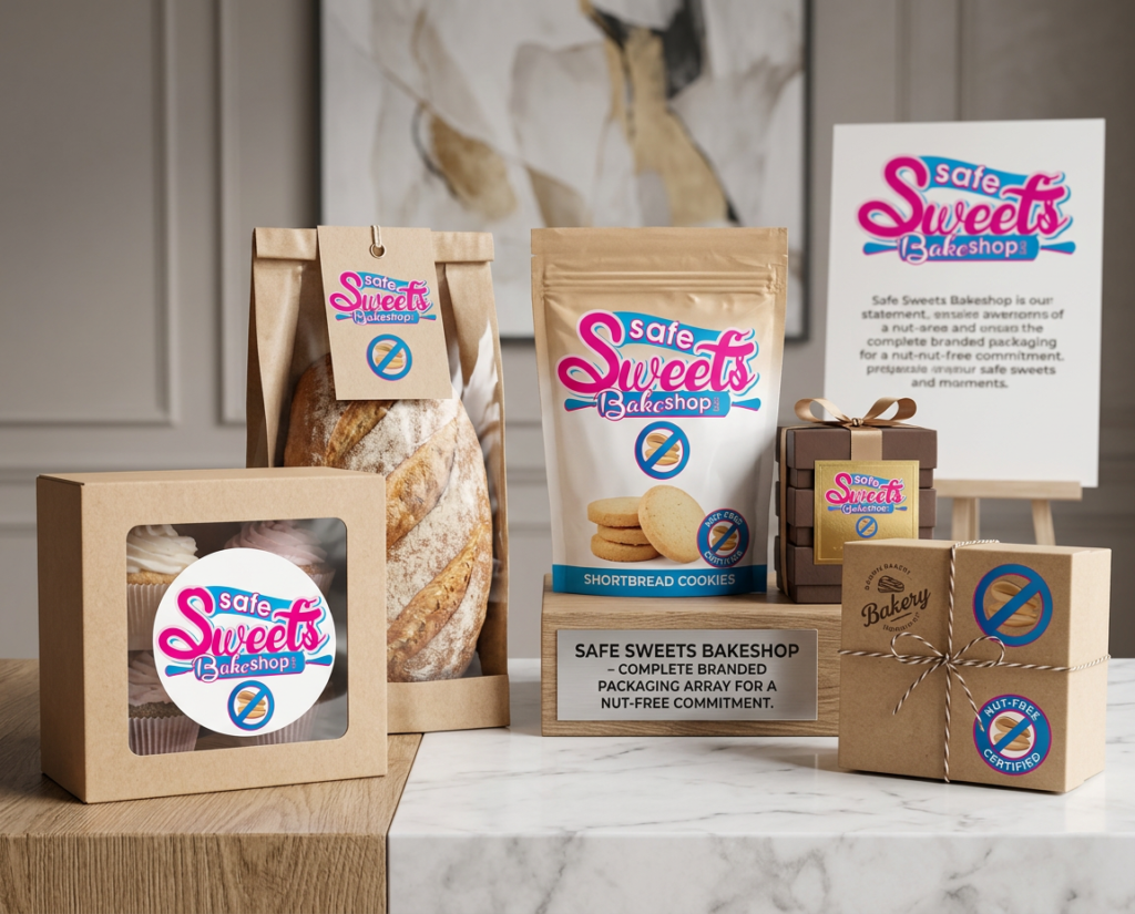
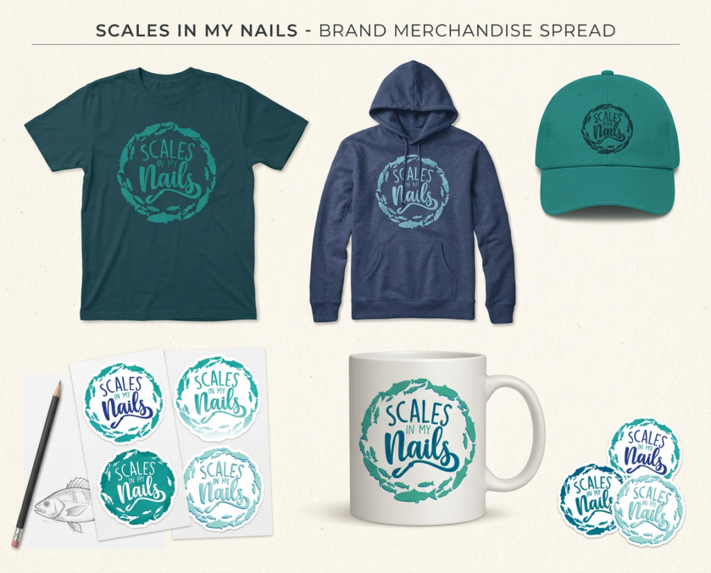
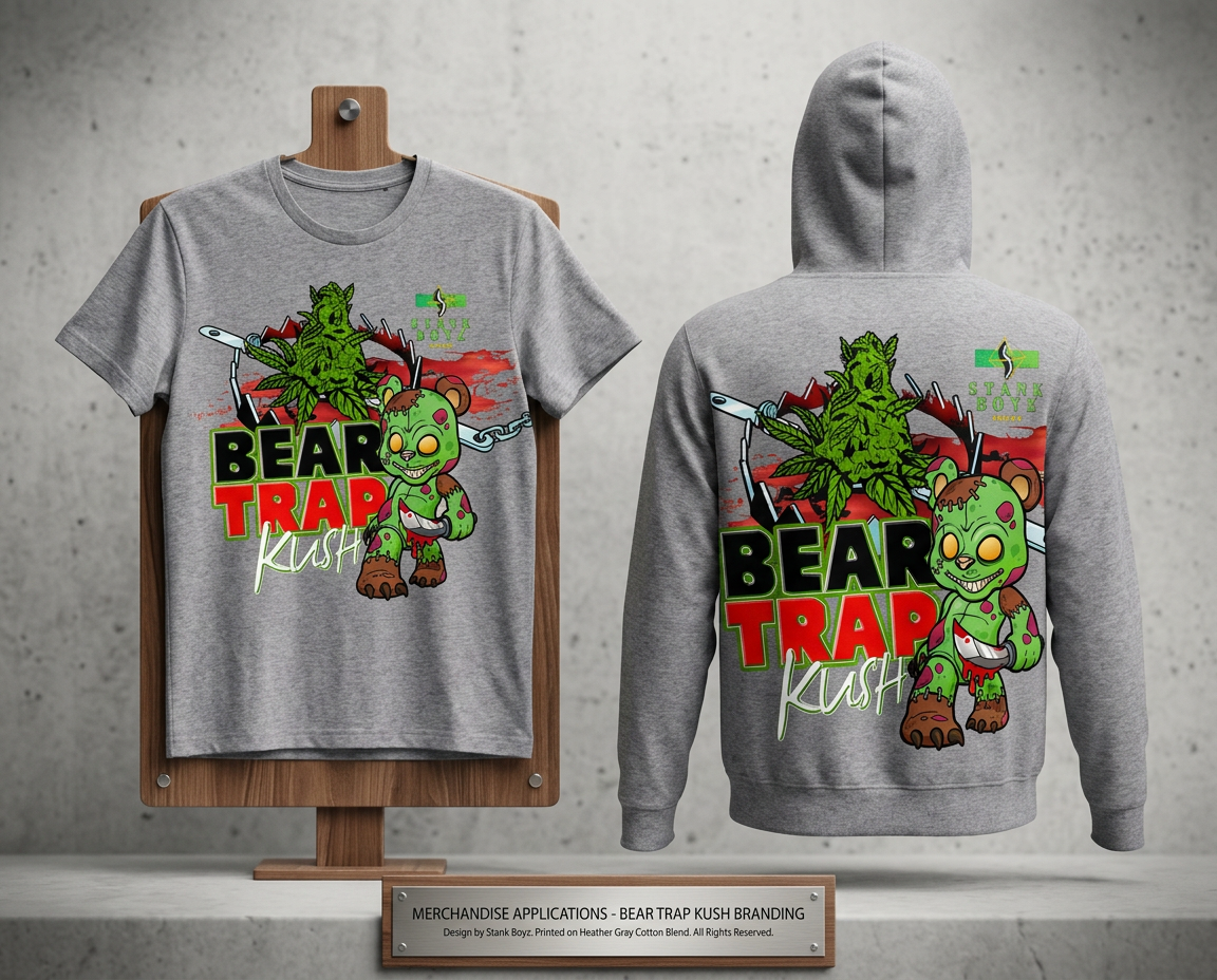
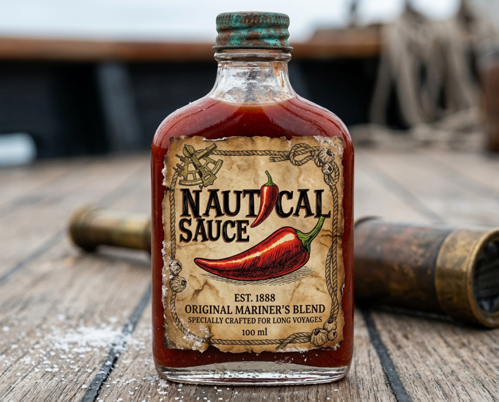
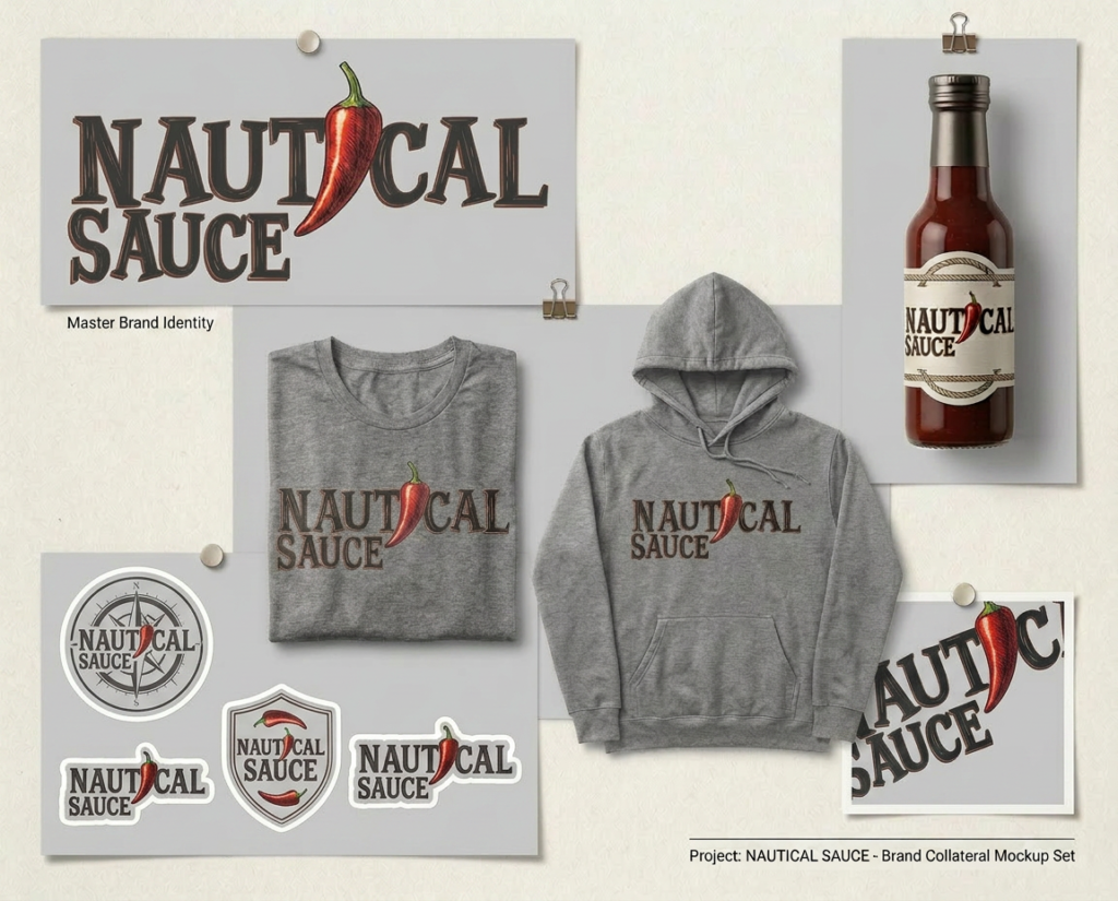
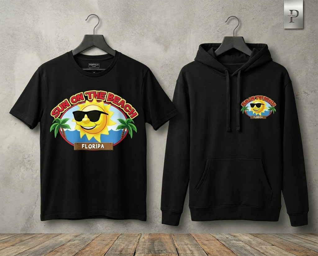
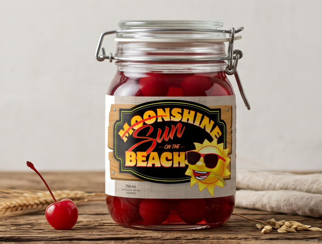
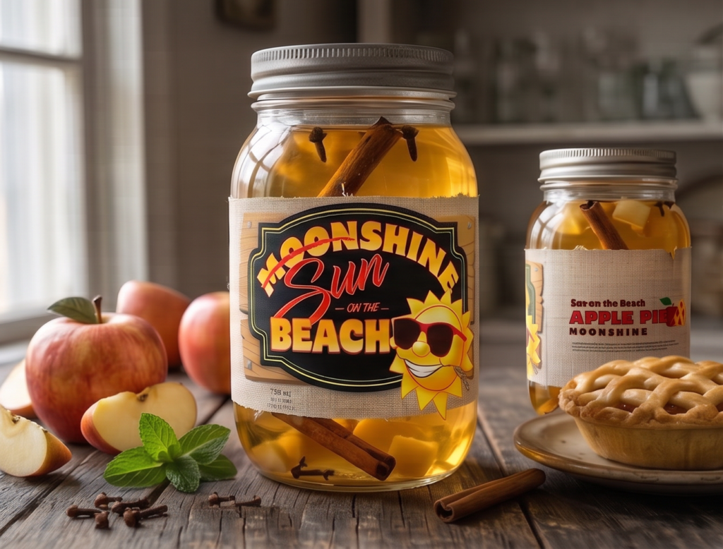
Brand Trade Show Booths & Merchandise Design
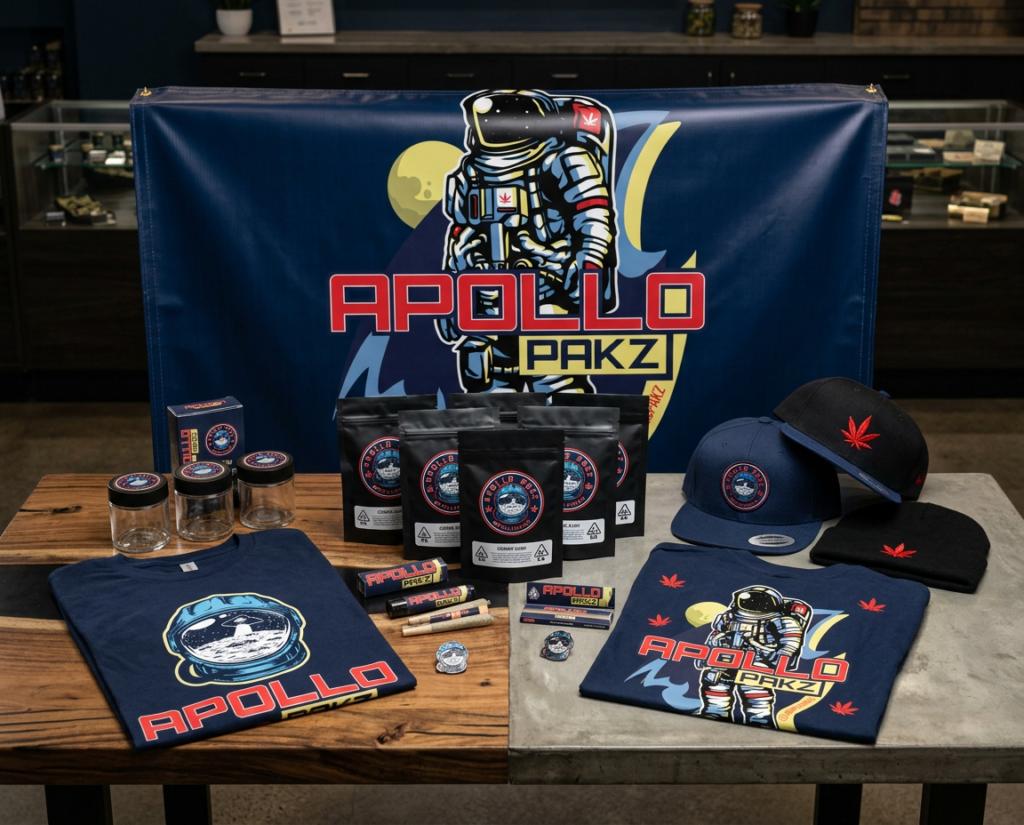
More logo designs by Margot Street